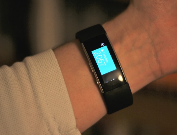
First off, all the sensors and technology in the first Microsoft Band is still in the new 2015 version, but now we have a barometer too, taking the count up to eleven.
- Heart rate monitor
- GPS
- Accelerometer
- Gyrometer
- Light sensor
- Microphone
- UV sensors
- Thermometer
- Capacitive sensor
- Galvanic skin response
- Barometer
The real changes are in how the device feels on my wrist.
The screen is now curved and made of glass, the main body is now metal and also curves around the wrist. The band itself is now significantly more flexible (as it doesn’t include the batteries) and the overall experience is one of a much higher quality device.

I didn’t really have any problems with the original device feeling too bulky at the time, but when compared to this updated version it would be hard to go back.
There are other less obvious changes too. The software on the device is much nicer to use – the team has clearly been listening to feedback and made various screens much more useful. An example is pausing a run. The previous version was all too easy to accidently end the run by brushing the screen with your finger by mistake – now you need to swipe across and press the end run button.
The existing sensors have also been put to better use too. You can now set alerts for UV and use a smart alarm feature to wake up at the optimal time. Very handy.
Microsoft’s approach to personal health has changed recently with the shuttering of the MSN Health & Fitness app, and I’m hoping that they bulk up their new Microsoft Health offering with more of the smart insights we were promised – but I’ll save that discussion for another day… hopefully when the long awaited universal version of the app comes out for the Windows 10 desktop. It’s soon, right?

Using the Microsoft Band has helped me get fitter and feel healthier. The Band 2 does all of that and packs it all into a better looking and higher quality package.
I recommend it.