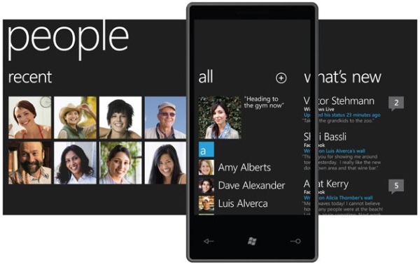
I saw that there was a very interesting post on the Windows Phone Developer Blog about the Metro design philosophy titled ‘From Transportation to Pixels‘ and I wanted to add a few thoughts on the process of designing an application which uses Metro.
There’s always a lot of fads which come and go in user interface design. (Glossy buttons anyone?) but good design lasts forever. One of my favourite designers is Dieter Rams – some of the stuff he made with Braun was very impressive (as Apple have noticed).
Dieter Rams ‘good design’ principles
- Good design makes a product useful
- Good design is aesthetic
- Good design helps us to understand a product
- Good design is unobtrusive
- Good design is honest
- Good design is durable
- Good design is consequent to the last detail
- Good design is concerned with the environment
- Good design is as little design as possible
While this is mainly about hardware, many the principles still hold strong for software – including applications designed to follow the principles of the Metro design language.
Actions for designing Metro applications
Keep it light & simple
- Focus on primary task
- Do a lot with very little
- Fiercely reduce unnecessary elements
- Use whitespace to delight your users
- Make sure things feel fast and responsive
Typography is ideal for information
- Remember that type is beautiful
- Use clear, straightforward information design
- Be uncompromising in sensitivity to weight, balance and scale
Motion brings your app to life
- Make it feel responsive and alive
- Use transitions to give context and improve usability
- Create depth and dimension by using motion
Focus on content, not chrome
- Delight users through the content instead of decoration
- Reduce visuals that are not content to the minimum
- Content can become the UI so users interact with the content directly
Be honest
- Design for the form factor
- Be authentically digital
- Don’t try to make it what it’s NOT
- Always be direct
While I do believe that the Metro design principles are super important, I do not feel the need to treat them like a fad and just start redesigning everything in the name of Metro. For example – I have seen people update their websites and say “Hey look at my new Metro site!” which just makes me think they are missing the point…
Follow the actions listed above at all stages of your application design, and make sure it fits in with the good design principles that has lasted for so many years. Keep at it, and you can’t go wrong.
But don’t kid yourself – Metro is not the ultimate interface, it’s just the (very cool) start of a whole new generation.