There was a little stir about the Facebook Beta for Windows Phone when it came out. Check out the comments on the official post. A few news sites covered the release, which ended in similar comments. This got me thinking about my view on the situation…
Why has the Metro design gone? Where is the uniqueness of Windows Phone?
Yes, as immediately noticed by those who care – the app doesn’t use the Metro hub pattern that the previous app used, but in my opinion it doesn’t matter because Facebook have their own design language.

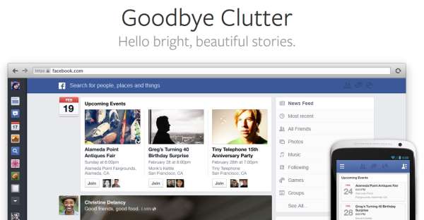
In March Facebook announced an update to the News Feed that will bring a lot of design elements from their mobile applications into their main web application, here they clearly state that they’re after a consistent user experience across all of their platforms. While there’s no doubt that the design borrows heavily from Android and iOS apps, but – more importantly to me – it also is very similar to the mobile web experience, which was my primary way of accessing Facebook throughout the day.

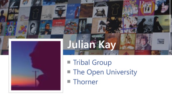
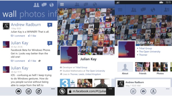
But the principles are forward looking and similar to Metro, Facebook are focussing on stories and imagery, removing clutter and keeping their distinctive look with the typography and colour choices that users are familiar with. See below an example of how the same information is displayed on both the old and new versions of the Facebook app for Windows Phone. Which one looks more like Facebook?

By focussing on Facebook design language rather than Windows Phone design language, they’re actually following one of the most important UI principles for Windows Phone – content over chrome. Where the Facebook experience is the content, and the previous Metro UI treatments – like larger fonts and the main panorama – were essentially just chrome.
Does this mean the end of the Metro design language? Obviously not.
My personal view is that the built in templates that come with Windows 8 and Windows Phone 8 are to be used as starting points. You get a lot of good design for free that way, but if your application has its own way of doing things then the Microsoft development tools will allow you to craft them. Real designers make the best decisions from the options that are available to them. In this case, the consistent Facebook experience makes the most sense.