I thought I’d write down some of my thoughts on how I’m productive on Windows 10 now that it has been out for a little while and all of my machines have been updated.
Including my phone and 7 inch tablet, I run Windows 10 on four machines:
- Sakura (Surface Pro 2)
- Shogatsu (Virtual Machine)
- Sumi (Stream 7 tablet)
- Satsuma (Lumia 630 phone)
The following discussion is only about the first two, which are both configured to be general purpose devices used for all sorts of tasks, including development and productivity. I’ll write about the phone and tablet another time.
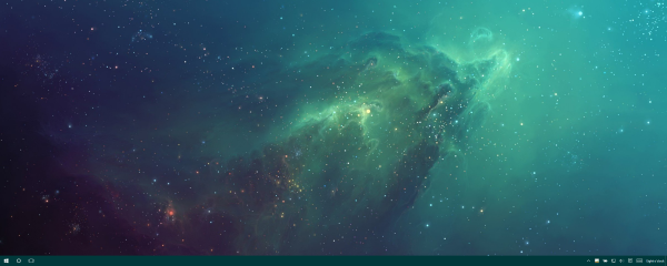
With Windows 10 the desktop is back on the PC and, as usual with my computers, there are no icons in sight. I use my desktop for temporary things, not as a place to keep anything for any extended amount of time. If I’m downloading a file to run it through a comparison tool or something like that, my desktop is fine.
I’m still using teal as the main colour for the user interface. I have used this on my workstations for a number of years now and, with Windows 10, the colour configuration is better than ever. You can choose to have it just as a highlight colour on top of black or have variations of the colour used throughout the Start Menu and Action Centre UI. I prefer the latter with this colour choice.
I feel like teal has worked really well for me, it’s fairly conservative and seems to fit into multiple uses really well:
- It is not too bright, and offers good contrast with both black and white
- It works well in both cool or warm lighting environments
- It doesn’t become too saturated when used with high F.lux settings
For my Surface, I have selected a nice ultra-wide space wallpaper which fits nicely with the colours I choose. This has been a real favourite of mine since I first started using it, but I am unsure who the original artist is. I’d love to give them credit.

I have no applications pinned on my taskbar so I get a really clean environment when I have nothing open. I launch all of my applications from the Start Menu or PowerShell.
I’ve loved using live tiles since they were first introduced on the phone. I enjoy the benefits you get from the glanceable information and I find the grid based organisational structure is way more useful than just a menu. My initial thoughts were that having the Start Menu in the corner may not be as good as having it full screen like on Windows 8, but I quickly changed my mind as soon as I started using it on the insider previews.
Right now, I have grouped the tiles into four main sections with the bottom right configured slightly differently depending on which machine I’m using.
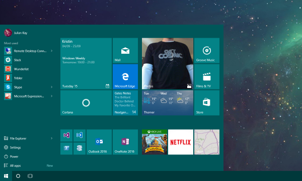
My current setup of tiles and most used applications is pretty much a snapshot in time though – I don’t feel like I have had enough time to really know what I want to have pinned here. At the moment I’m enjoying having a mixture of glancable information (Weather, Calendar, etc.) unread content counts (NextGen Reader, Mail, etc.) and launcher icons (Edge, Store, etc.).
I’m certain this will change quite a lot with use.
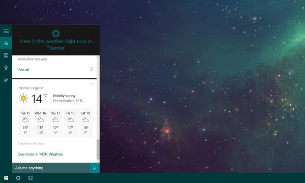
Cortana has been a very welcome addition to the PC. I’ve been using Cortana on my phone since the original previe, and she’s very much a part of my computer use now. She has had numerous improvements over her first iteration and now that she’s available through all my personal Windows devices, using her for things like reminders and glanceable information has been easier than ever.
I use her on my Surface quite a bit, though I do sometimes have trouble with her listening to me when I say ‘Hey Cortana’, so I usually just press WIN + C to activate her, then she has no trouble understanding my requests.
All of my requests are typed when I use the Virtual Machine. Typing requests is as easy as pressing the Windows key. I find typing to be just as natural as speech, and really fast when I’m using a desktop keyboard. I also tend to use the VM when I’m in locations where speaking wouldn’t be very useful anyway.
I have had issues with using the location-based features on the VM, but I worked around it using a Fake GPS driver.
The Task View is a another new addition to the Windows task bar, and even though I regularly use the key combination WIN + TAB to activate it, I still like to have the icon on the task bar anyway. This screen also includes the ability to add a number of virtual desktops. Surprisingly, I don’t use virtual desktops as much as I thought I would – but I am really glad they there when I do use them.
I originally thought I would always split things out every time I used the computer. For example, I thought that all my communications apps would always be in one desktop and development apps would belong in another. It just didn’t really happen that way. As I was regularly switching between them, I quickly got confused when I had more than a few apps open.
Virtual desktops become useful for me when I really want to concentrate on one or two different activities. I move their windows around on the Task View and put them into their own desktop to get a distraction fee environment when I need it. Ad hoc desktops to help me focus have been much more useful than trying to set rules for myself.
CTRL + WIN + LEFT and CTRL + WIN + RIGHT are used to switch back and forth between desktops. (I’d like to see better support for this with a three finger swipe on the trackpad please Microsoft!)
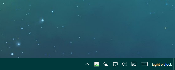
The Notification Area has been shuffled around a bit in Windows 10. The keyboard icon is now integrated and right next to the clock, and there’s now an additional new notification icon for the Action Centre.
I only show the very minimum of icons here – Process Explorer, Power, Network, Sound. I often use a FuzzyClock application to change how the time is displayed down here too. I am not a fan of using the notification area as a place to minimize windows, or launch applications.
Process Explorer is Microsoft’s ultra-nerdy replacement for the Task Manager and something I always use on my Windows machines. I find it to be way more detailed than the built in version and it includes many features developers find useful. As you can see from the screenshot, you also get a glanceable indicator of CPU usage here too. I find that CPU usage is often the most important metric for how the machine is doing, as I don’t really care how much RAM is being used unless I am having problems with something. If I do have problem, full access to everything running on the machine is just a click away.
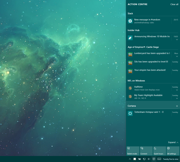
Action Centre is a welcome addition to Windows on the PC, and something I’m already well used to using, thanks to Windows Phone. The version that ships today is not perfect though. Over time I’d like to see better notification sync with the phone. I also find that the having a solid icon isn’t enough to really draw attraction to the fact there is a new notification pending. I’d like to see options here for flashing or some other more substantial indicator, though I have to admit, I probably wouldn’t want it to be like that all time.
In fact, when I’m trying to be super productive, I turn on Quiet Hours. I use this in combination with the Quite Hours feature on my phone to ensure I don’t get annoyed with notifications when I don’t need them. But they’re still a click away.
The utilities I have mentioned above, like FuzzyClock and Process Explorer, are tiny portable executables and don’t require some system-changing installation mechanism. All these small applications I use are stored in a Scripts folder I have been maintaining for years.
This folder lives in my profile under C:\Users\Julian\Scripts and is synchronised to a private Git repository hosted on Visual Studio Online. Inside there are a number of scripts to run automated tasks and setup my PowerShell profile to be exactly the same across machines. In addition to these scripts, there’s a Tools folder which contains all of these small utility applications as well as some larger applications which have been modified to work in a ‘portable’ way.
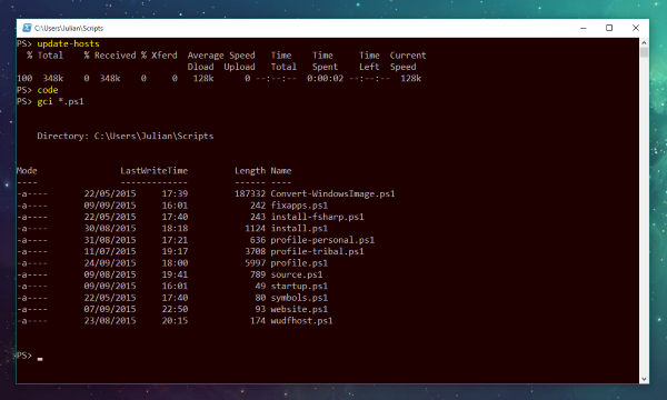
I spend a lot of my time in PowerShell and this folder is absolutely fundamental to how I complete many tasks on my Windows machines including, but not limited to:
- Scripting languages and runtimes – Ruby, Python, IKVM
- Text editors and UNIX utilities- Vim, grep, wget, curl
- Windows Tools – Process Explorer, Autoruns
- General Utilities – FileZilla, Far, WinMerge, Putty
- Plus years of PowerShell and F# scripts, registry files and more
I could probably go into more detail around this in the future. If you are interested, let me know in the comments.
Not everything is installed this way though. Some of the biggest applications I use require installation from the web through subscriptions, like Office 365 and MSDN:
- Outlook, OneNote, Visio and the rest of Office (from Office 365)
- Visual Studio Enterprise (from MSDN)
- Visual Studio Code, Node and Git (free)
- Wunderlist, Slack and Skype (free)
- 7-Zip, F.lux, Paint.NET (free)
And finally, there are a number of applications which either are preinstalled on Windows or I have to install from the Windows Store. The ones I use the most are:
- Groove Music, Film & TV, Photos and other entertainment apps
- MSN apps like Weather and Sports
- Audible, Netflix
- NextGen Reader
Applications installed through the Windows Store are super painless. I wish more applications could be installed this way. I’d like to see more parity with the phone too, and I’m sure that’ll be coming when Windows 10 Mobile ships at the end of the year.
Overall, I feel like I’m more productive on Windows 10 than I have been on any other operating system. I feel like things are only getting better in general – with things like SSH and containers coming soon, the future is pretty bright for Windows 10.