I haven’t written on my blog for absolutely ages. But I am certain that past-me (who setup this blog in 2010) wouldn’t be very happy if I didn’t write about returning to the Mac.
If you didn’t know already, past-me could definitely be described as being a bit of a Microsoft fanatic. It’s not because I thought they were perfect, but as a Windows developer it was nice to have everything all working inside this Microsoft ecosystem. I had a Lumia in my pocket and a Band on my wrist.
In my absence from publishing on this site I switched to using an iPhone and Apple Watch. The long eventual death of Windows Phone and the Microsoft Band meant that my dreams of having the Microsoft ecosystem in my pocket had also died.
Now I have extended my use of the Apple ecosystem beyond just the iPhone and Apple Watch. At the start of this year I invested in an iPad, and this month I have taken the even bigger step of switching to use a MacBook as my primary computer.
Yup, I fully intend to use this shiny new MacBook as my primary computer, replacing the long line of Surface and Surface Books I have been using since 2013.
One important thing to note is that I still use my existing Windows and Linux computers every bit as much as before – I am using macOS to connect to my Windows and Linux computers remotely using the Microsoft Remote Desktop Client.
So far I’m still getting used to macOS but I will say that the initial reception has been pretty good. I really appreciate how silky smooth the transitions are when navigating between applications. The way that full screen apps and desktops work together also makes for a really great workflow for me, as I can use my remote connections in full screen and switch between them using gestures.
There’s a long way for me to go in terms of really getting comfortable with using macOS for more intensive tasks other than using a browser and productivity apps – so maybe I’ll return to some of these ideas in a future blog post.
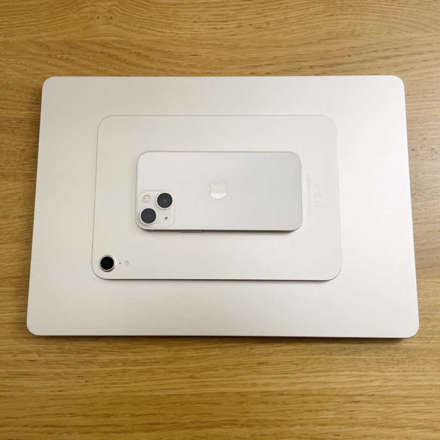
As with most Apple hardware, the industrial design is absolutely fantastic. I have the MacBook Air with M2 which uses the latest design trends for Apple’s MacBook and also features the return of the MagSafe charging port. My old 2008 Mac also had MagSafe, so for me this is just standard. I went for the option with 8-Core CPU, 10-Core GPU, 24GB Unified Memory, 512GB SSD, and yes, the battery life does appear to be just as impressive as advertised.
I haven’t yet hit any trouble with dongles… but maybe I’m too early in my journey to feel that pain.
This little Mac sits really well with my family of other Apple devices too. At time of writing I use the following devices throughout the day:
- MacBook Air
- iPad mini
- iPhone mini
- Apple Watch
- Apple AirPods
When I’m at home I can easily plug the MacBook into my 4K screen and use a Magic Keyboard and Magic Mouse, and the iPad and iPhone on my desk around me. When I’m out and about these are the only devices I need, and I can use the MacBook for hours without being plugged into anything.
- Handover provides prompts to move experiences between devices
- Universal control allows for one mouse and keyboard to use many devices
- Apple Pay, Face ID, and Touch ID are setup on everything
- Apple Watch can unlock the MacBook by just sitting at it
It’s all very slick, and I haven’t had any major issues yet.