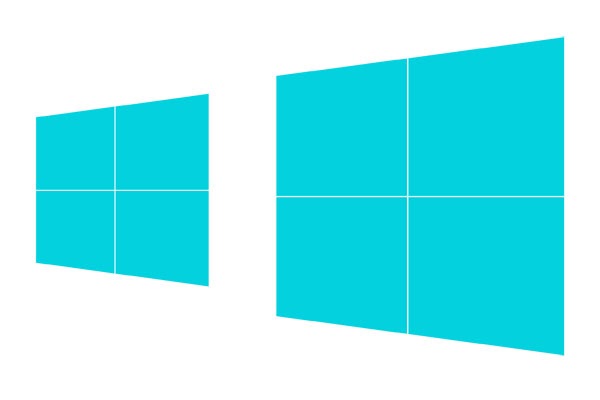
The new Windows 8 logo, as shown above from the Microsoft blog post that announced it, has been designed to compliment the Metro Design Language and also has roots in the Swiss International Style, which is all about typography, solid colours, strong lines and grids.
Over all I like it, but when I first saw it I felt like something was a little off with the ‘beams’ on the window. It looked like the perspective was messed up or something.
Later I came across an article about the new logo by the design agency Pentagram – who were commissioned by Microsoft to create the new logo. After thinking about it for a little while I understand that the beams are like a grid on top of the rectangle shape, and because of this understanding the logo looks better to me.
This is a bit like seeing the arrow in the FedEx logo for the first time.

You can tell this version of the logo looks slightly different to the one posted on the Microsoft blog. As Pentagram explains, the window shape itself has been chosen to be a rectangular shape in perspective, but the actual beams (or grid lines) are separate from the shape.
The perspective drawing is based on classical perspective drawing, not computerized perspective. The cross bar stays the same size no matter the height of the logo, which means it has to be redrawn for each time it increases in size, like classic typography.
You can see these lines are cut out of the coloured shape, and are not in perspective at all. The idea is that each time the logo is drawn the lines are always the same size, as shown below.

Seeing the logo in this view makes me appreciate the design a lot more, but the problem is that the version that is on the Pentagram website is actually quite different to the one on the Microsoft site.
Here is an animation which Kean created for me which show the difference in the beams and text between the two.

So which one is the real Windows 8 logo?
I find it really hard to believe that Microsoft would be able to convince everyone – from OEMs to the press – to render a version of the logo for the exact size they need, every time they need it. So I think they’ve had to compromise on the design given to them by Pentagram.
I’m not sure which is the ‘real’ Windows 8 logo yet, or if Microsoft are going to make any more changes before it gets released to the public. But I’m going to place my bets on the version that Microsoft posted to their blog.
I’m assuming they’ve just picked a width for the beams which fits well for the majority of sizes shown in the new operating system, and decided to stick with that moving forward.
I wasn’t the only person to notice this, Long Zheng has a write up on his excellent blog. He suggests changing the beams to fit in with the perspective of the rest of the logo, and I think his version looks pretty good too.